Power BI Reports
Microsoft Power BI is a unified, scalable platform for self-service and enterprise business intelligence (BI). We use this tool to connect and visualize the data collected in the platform, which provides you a strong data visual into your cost, GL, services, savings, and inventory.
The Power BI Reports consists of several standard dashboards:
Dashboard Name | What it shows you… |
|---|---|
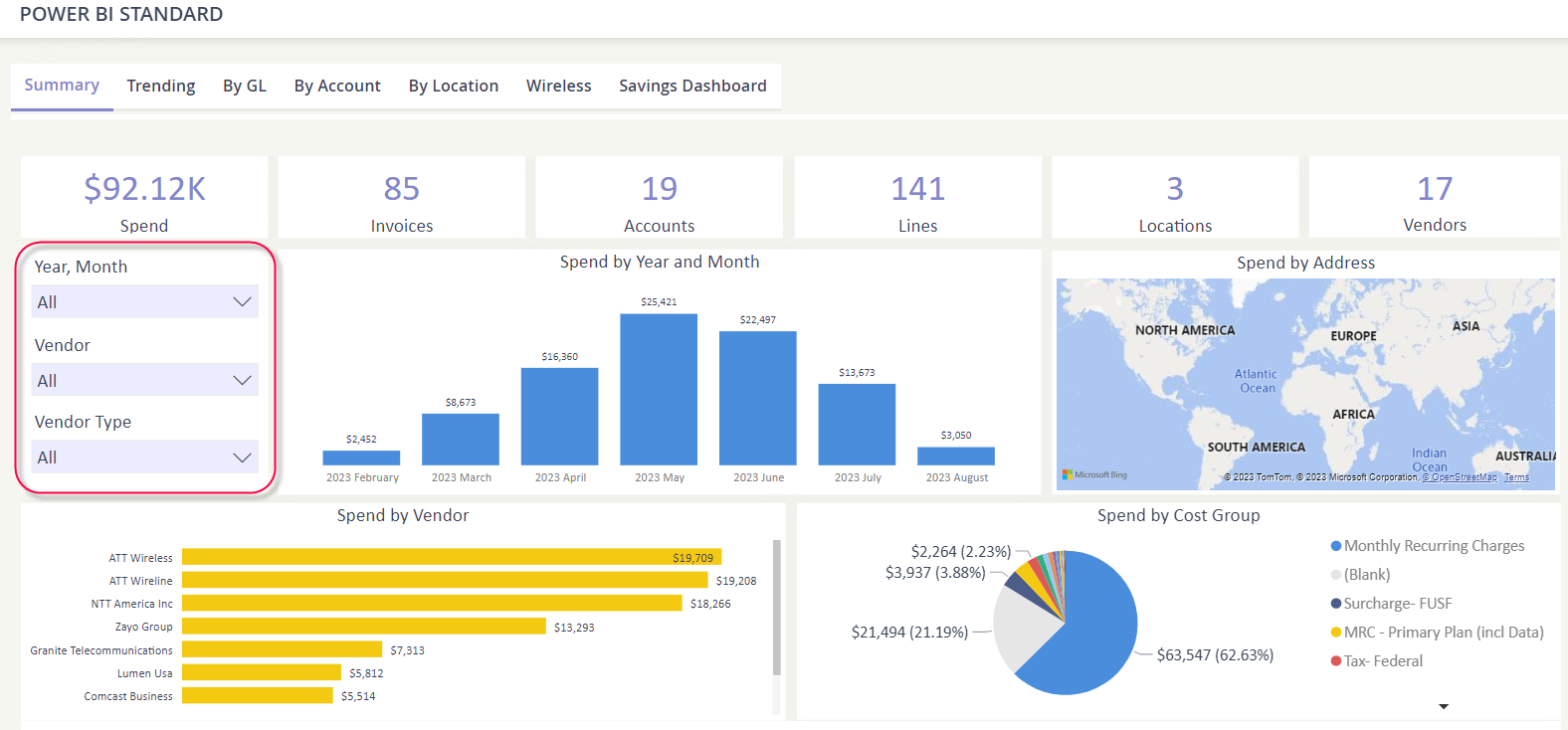
Summary | Overall counts of your TEM environment and spend by vendor, cost group, address, and year. |
Trending | Spend by vendor for a period of time, which can be adjusted with the main dashboard filters. |
By GL | See a visualization of your spend and the GL Codes used to allocate your invoices each month. |
By Account | See the invoice charges for your Accounts & Subaccounts by various categories. |
By Location | See your spend by location. *Requires that you maintain accurate location association with your services. |
Wireless | See your wireless specific spend by year and lines. |
Savings Dashboard | See the realized and pending savings that have been captured in the Savings Module. |
The visualizations you see on the dashboard, such as charts, graphs, tables, are called tiles. You may interact with each tile, such as:
Applying a filter
Sorting the data
Exporting the results
Navigating a dashboard
When you select the Power BI Reports menu option, the Summary dashboard will open by default. You may tab through the other labelled dashboards to see the other aspects of your data.
Filtering
Each dashboard will provide you the opportunity to apply a Main Filter, typically a date range, vendor, and vendor type (wireless or wireline). The Main Filter will apply to all the tiles.
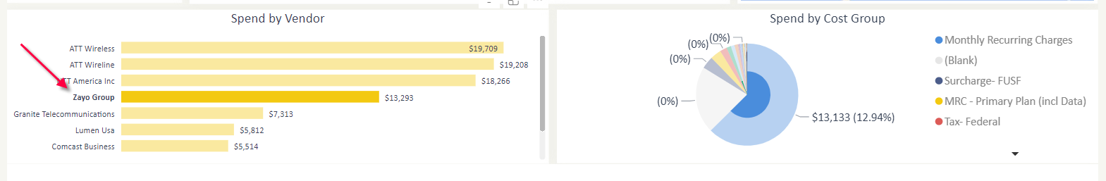
You may also click on a tile element, such as clicking on a vendor data bar, to filter your dashboard. If you hold down the “ctrl” key, you can select multiple elements within the tile as well.
Sorting your tile
You may sort data within a tile by clicking on the triple dot icon and then hover over Sort axis to see your sort options. The sortable values will vary based on the tile.

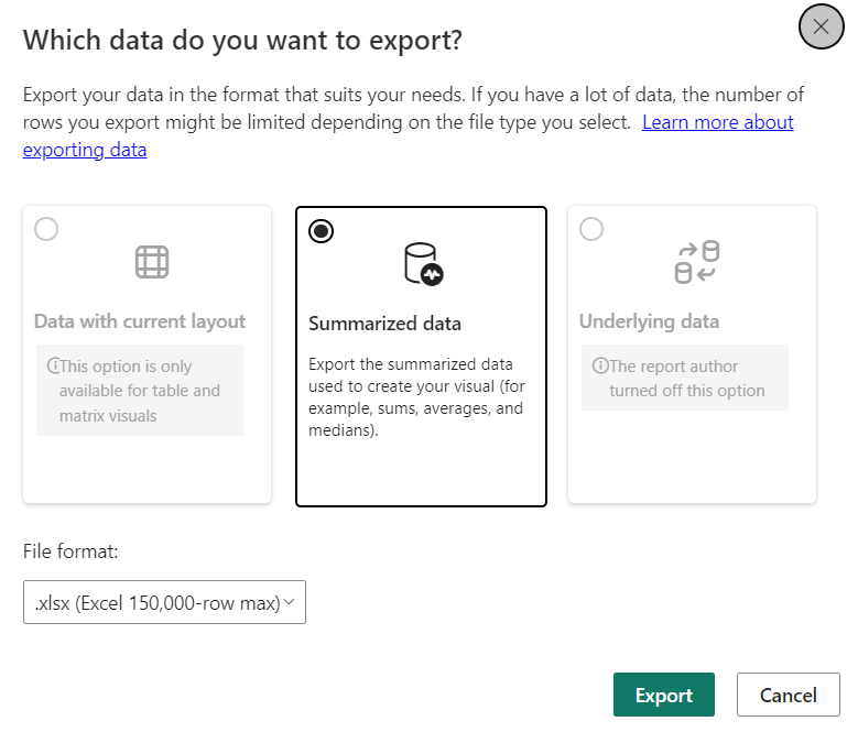
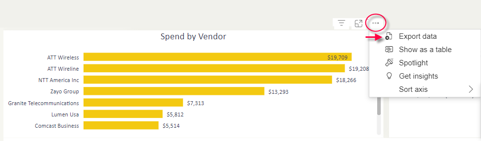
Exporting data
You may export each tile within a dashboard by clicking on the triple dot icon and then select Export data.
You will be presented with the allowable export options for the tile. Select how you want to export your data and then the file format. Click Export to begin the action.